Analytics Dashboard
Navigate the SortLab analytics dashboard to track revenue, orders, and collection performance across your store.
Analytics Dashboard
The Analytics dashboard gives you a comprehensive view of how your sorting strategies are impacting store performance. Use it to track revenue, monitor collection health, and identify opportunities to optimize your product order.
Choosing a time period
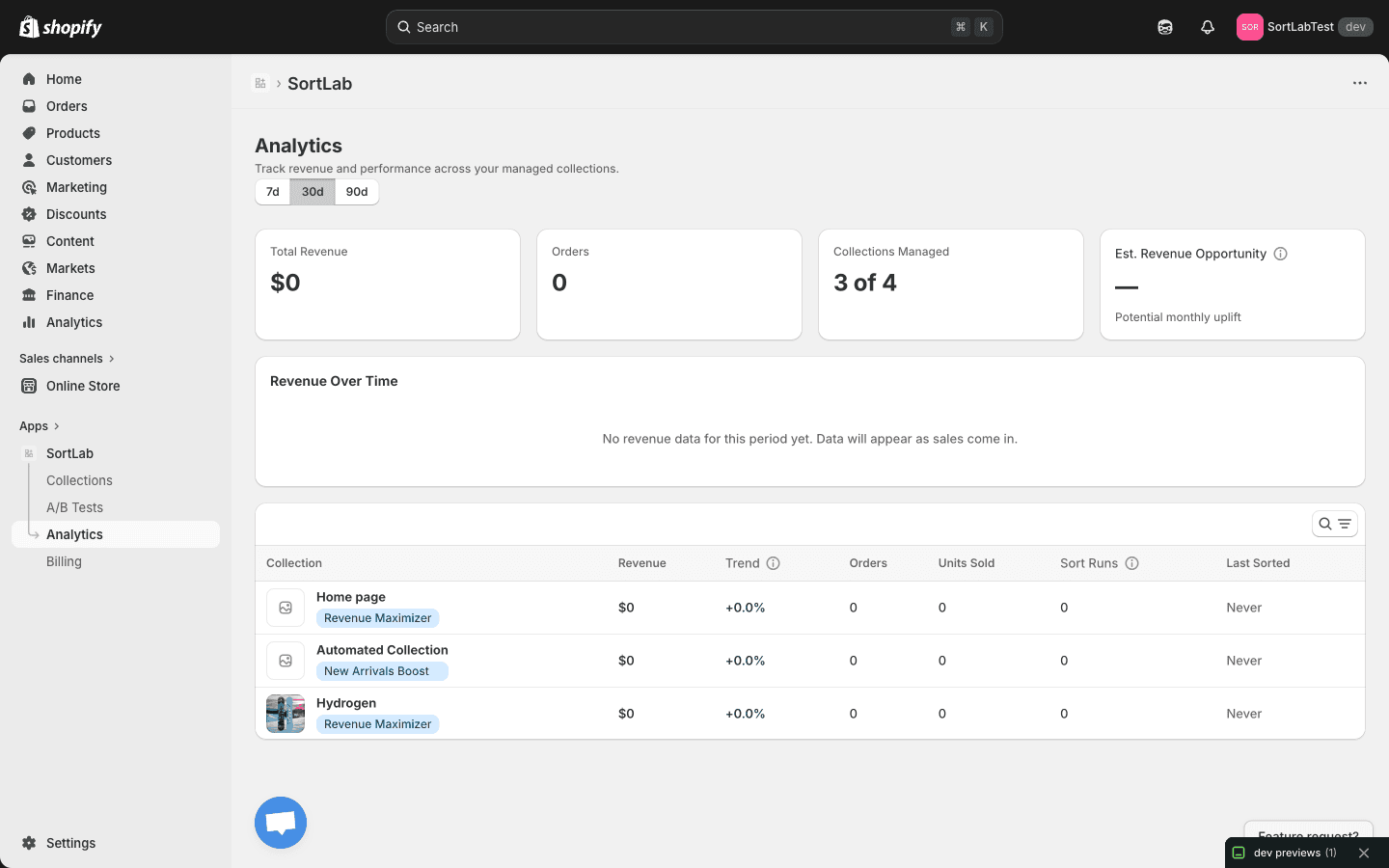
At the top of the Analytics page, you'll find three time period toggles that control the data shown across the entire dashboard:
| Period | What it shows | Best for |
|---|---|---|
| 7d | Last 7 days | Spotting immediate impacts after a strategy change or sort run |
| 30d | Last 30 days (default) | General performance monitoring and trend analysis |
| 90d | Last 90 days | Identifying long-term patterns and seasonal trends |
Switching between periods updates all metrics cards, the revenue chart, and the collection performance table at once, so you always get a consistent snapshot.
When you first install SortLab, your dashboard will be empty. Metrics begin populating as soon as orders come in for collections that SortLab manages. Give it a few days to accumulate meaningful data.
Understanding the metrics cards
The top of the dashboard displays four summary cards that give you an at-a-glance view of your store's performance:
Total Revenue
The total revenue generated by products in your managed collections during the selected time period. This includes all orders placed for products that belong to at least one SortLab-managed collection.
Orders
The total number of orders that included at least one product from a managed collection. This helps you understand order volume alongside revenue.
Collections Managed
Shows how many of your store's collections are actively managed by SortLab versus your total collection count (e.g., "3 of 4"). This is a quick way to check your coverage and see whether you have collections that could benefit from sorting.
Est. Revenue Opportunity
An estimate of the potential monthly revenue uplift you could gain by optimizing your remaining unmanaged collections or upgrading your sorting frequency. This metric is calculated based on the performance improvements SortLab has delivered for your managed collections.
The Revenue Opportunity estimate appears once SortLab has enough historical data to project potential gains. If you see a dash (--), keep your collections managed for a few more weeks to allow the estimate to be calculated.
Revenue Over Time chart
Below the metrics cards, the Revenue Over Time chart plots daily revenue for your managed collections across the selected time period. Use this chart to:
- Spot trends — See whether revenue is climbing, flat, or declining over time
- Correlate changes — Compare revenue before and after applying a new sorting strategy or running an A/B test
- Identify anomalies — Notice unusual spikes or drops that may be tied to promotions, stock changes, or seasonal demand
The chart updates automatically as new order data comes in. If no revenue data is available for the selected period, you'll see a placeholder message indicating that data will appear as sales are recorded.
Collection performance table
The bottom section of the dashboard contains a detailed table that breaks down performance by collection. Each row represents one managed collection and includes the following columns:
| Column | What it shows |
|---|---|
| Collection | The name of the collection |
| Revenue | Total revenue generated by products in this collection during the selected period |
| Trend | Percentage change in revenue compared to the previous equivalent period (e.g., current 30 days vs. prior 30 days) |
| Orders | Number of orders containing products from this collection |
| Units Sold | Total units sold across all products in this collection |
| Sort Runs | How many times SortLab has sorted this collection during the selected period |
| Last Sorted | The date and time of the most recent sort run |
Using search and filters
The table includes a search bar that lets you quickly find a specific collection by name. This is especially useful if you manage many collections and want to check the performance of a particular one without scrolling.
Sort the table by clicking any column header. For example, click Revenue to find your top-performing collections, or click Trend to see which collections are growing fastest.
Tracking the impact of sorting changes
The Analytics dashboard is your best tool for measuring whether a strategy change is working. Here's a practical workflow:
- Note the date when you change a collection's sorting strategy or apply a new configuration
- Wait 7 to 14 days to let enough data accumulate for a meaningful comparison
- Switch to the 30d view and look at the Revenue Over Time chart for a visible trend shift around your change date
- Check the Trend column in the collection performance table to see if the percentage change is positive
- Compare Sort Runs to make sure automated sorting is running at the expected frequency
If you want a more rigorous comparison, consider setting up an A/B test before making a change. A/B tests give you a controlled way to measure the impact of one strategy against another.
Next steps
- Understanding Metrics — Dive deeper into what each metric means and how to use them for data-driven decisions
- Sorting Strategies — Explore the strategies you can apply to improve the numbers you see here
- A/B Testing — Run controlled experiments to validate your strategy choices